

Charts for appraisers
Dynamo MC comes with a huge selection of charts for appraisers that can easily be generated using your market data. These charts may be individually added to your appraisal report, and are available in a variety of different colors. The charts available in Dynamo MC are shown and described below (in default colors).
Sale Price
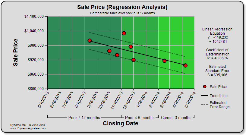
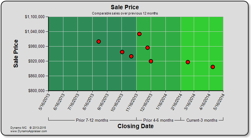
The “Sale Price” chart shows the reported close price for sold properties on the market. This chart is available with and without regression analysis.
Sale Price per Gross Living Area
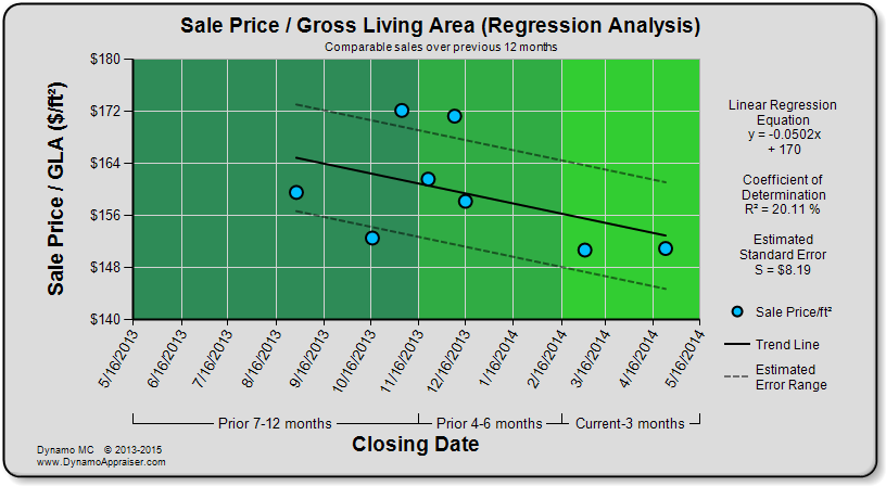
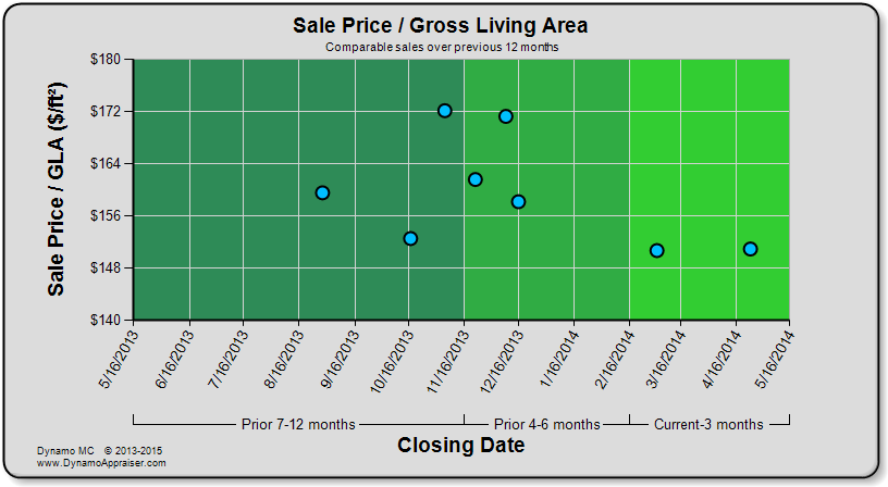
The “Sale Price per Gross Living Area” chart shows the reported closed price divided by the reported gross living area for sold properties on the market. In some markets, this chart may be provide an alternate method to analyze property value trends. This chart is available with and without regression analysis.
Sale Price vs Gross Living Area
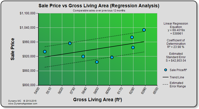
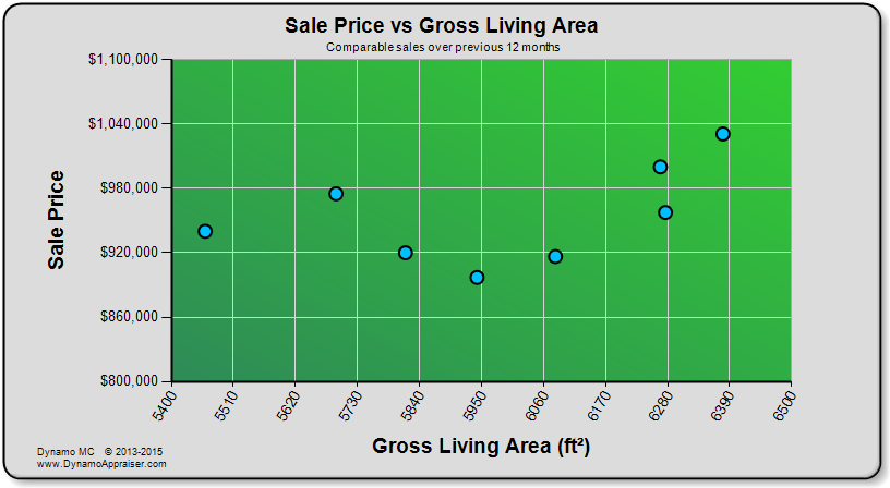
The “Sale Price vs Gross Living Area” chart shows the reported closed price compared to the reported gross living area for sold properties on the market. This analysis includes all properties sold during the year considered, and does not adjust for time in the analysis. In some markets, this chart may be reveal how much the value of a property can be expected to rise of fall as the size of the home changes. This is the most dependable when the properties being considered do not vary significantly from each other in attributes other than living area. This chart is available with and without regression analysis.
Active Listing History

The “Active Listing History” chart shows a day-by-day breakdown of the number of active listings on the market. This step line chart and will show straight line runs during time periods where no properties are added or removed from the market. This chart provides most most detailed visual representation of daily changes within the market, and may reveal rapid daily inventory changes within busy markets.
Activity History

The “Activity History” chart shows graphical representation of the market lifetime of each property included on the market. This chart will show active marketing periods, periods in which the sale of the property is pending, and the days where a property finally becomes a closed sale or otherwise becomes inactive. This chart will begin when the first property in your data becomes active on the market.
List Price

The “List Price” chart shows the reported list price for all properties on the market. This chart will begin when the first property in your data becomes active on the market. This chart is available with and without regression analysis.
List Price per Gross Living Area


The “List Price per Gross Living Area” chart shows the reported list price divided by the reported gross living area for all properties on the market. In some markets, this chart may be provide an alternate method to analyze listing price trends. This chart will begin when the first property in your data becomes active on the market. This chart is available with and without regression analysis.
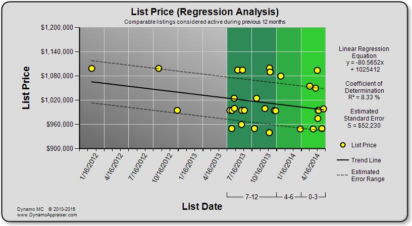
List Price vs Gross Living Area


The “List Price vs Gross Living Area” chart shows the reported list price compared to the reported gross living area for all properties on the market. This analysis includes all properties listed during the year considered, and does not adjust for time in the analysis. In some markets, this chart may be reveal how much a list price can be expected to rise of fall as the size of the home changes. This is the most dependable when the properties being considered do not vary significantly from each other in attributes other than living area. This chart is available with and without regression analysis.
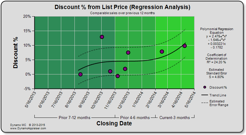
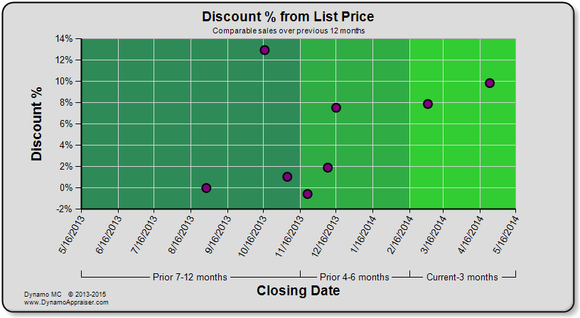
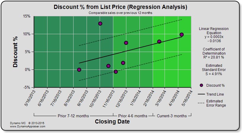
Discount % from List Price


The “Discount % from List Price” chart shows the discount that properties finally sold at given their reported list prices. When a property sells for less than it was listed for, the discount will be positive. When a sale price is higher than the listing price, the discount will be negative. This chart is available with and without regression analysis.
Sales Days On Market
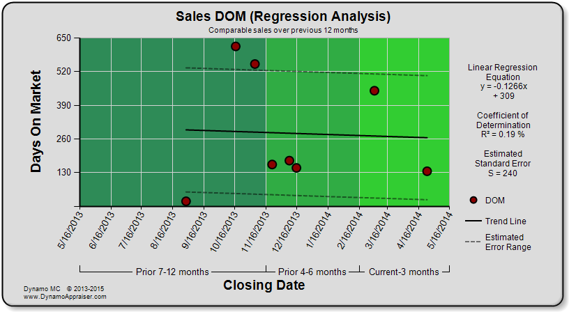
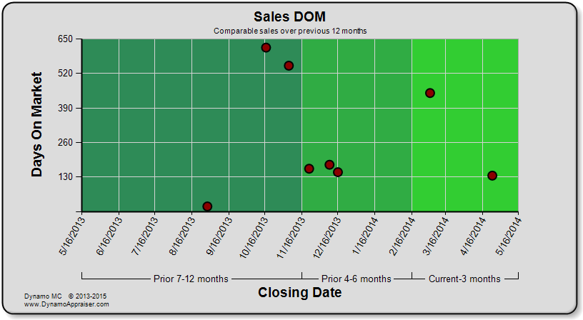
The “Sale Days On Market” chart shows the number of days that sold properties were actively listed on the market prior to closing. This chart is available with and without regression analysis.
Monthly Median Price
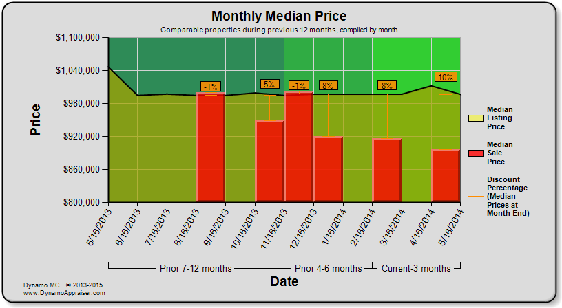
The “Monthly Median Price” chart shows the median price for both closed sales and active listings on the market, compiled by month. This chart uses a bar chart component to represent the closed price for sales that have occurred within that month, and an area chart component to accurately measure the listing price for all active listings at the beginning and end of each month. Additionally, the discount percentage between median values shows the difference between these two values.
Monthly Sales & Listings
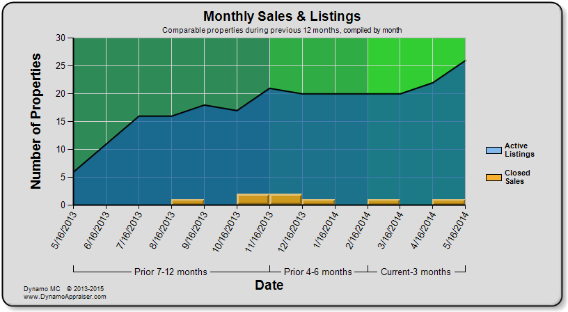
The “Monthly Sales & Listings” chart shows the total number of closed sales and active listings on the market, compiled by month. This chart uses a bar chart component to represent the number of closed sales that have occurred within that month, and an area chart component to accurately measure the number of active listings at the beginning and end of each month.
Monthly Median Price per Gross Living Area

The “Monthly Median Price per Gross Living Area” chart shows the median price per square foot of GLA for both closed sales and active listings on the market, compiled by month. This chart uses a bar chart component to represent the closed price per square footage for sales that have occurred within that month, and an area chart component to accurately measure the listing price per square footage for all active listings at the beginning and end of each month.
Monthly Housing Supply
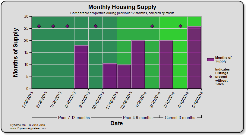
The “Monthly Housing Supply” chart shows the months of supply remaining on the market, compiled by month. This chart considers the number of sales that have occurred during the month and the number of listings that remain at month’s end. When listings were present, but no sales occurred (and therefore no demand was present), a special symbol is displayed. This ensures that the reader can tell the difference from months where no listings were present (which is an entirely different market condition). This chart provides an excellent way to indicate when market over-supply and under-supply spikes occur.
Monthly Median Days On Market

The “Monthly Median Days On Market” chart shows the median number of days that both closed sales and active listings have been on the market, compiled by month. This chart uses a bar chart component to represent the final days on market for sales that have occurred within that month, and an area chart component to accurately measure the listing days on market for all active listings at the beginning and end of each month.
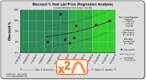
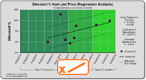
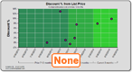
A note on regression types
Dynamo MC allows an appraiser to specify the type of regression (linear or polynomial) to apply to scatter charts. Here is an example of different trend lines applied to the “Discount % from List Price” chart:
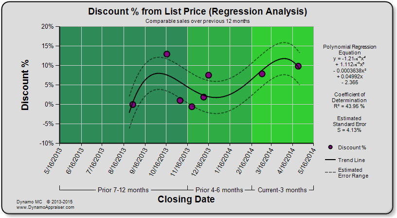
4th Order (Quartic) Trend
3rd Order (Cubic) Trend

2nd Order (Quadratic) Trend

1st Order (Linear) Trend
No Trend
Automatic Trend (A linear trend was the best fit for this data)
Don’t see the chart you need?
Let us know! We’ll consider adding it in a future version of Dynamo MC.
Don’t like the default colors?
That’s not a problem! We have many other color palettes available, so you’ll be able to find colors that work for you. If you have a specific request for colors, please let us know and we will consider adding them in a future version of Dynamo MC.